Ethereality and Kore: Ethereality Zine came before Kore Mag so I designed both the original zine logo and moodboard design and the logo and moodboards for the re-design. I worked closely with the Editor-in-Chief and Founder of the zine to help bring their vision to life! Utilizing a branding questionnaire helped the founder better develop the idea of the brand before diving in to moodboards and color palettes.
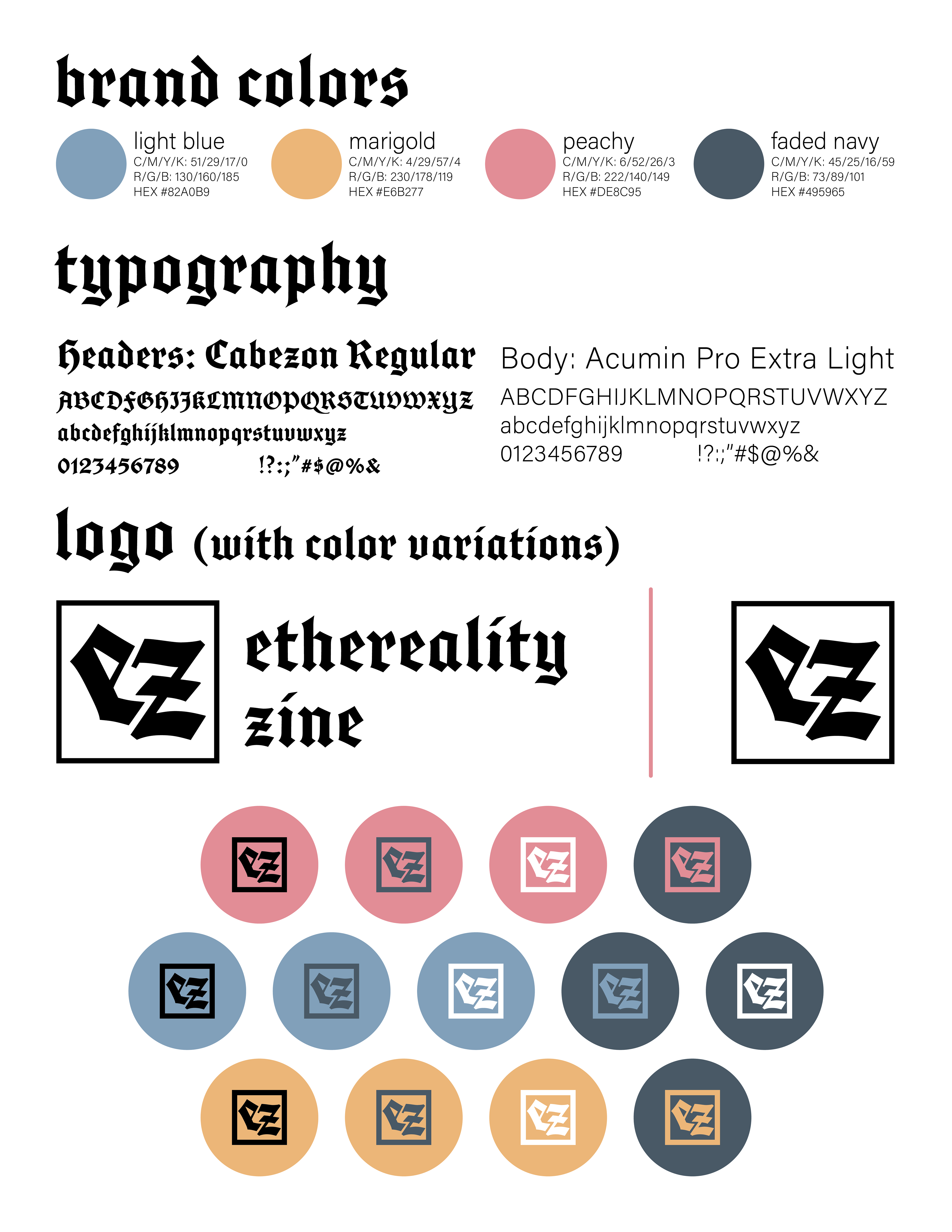
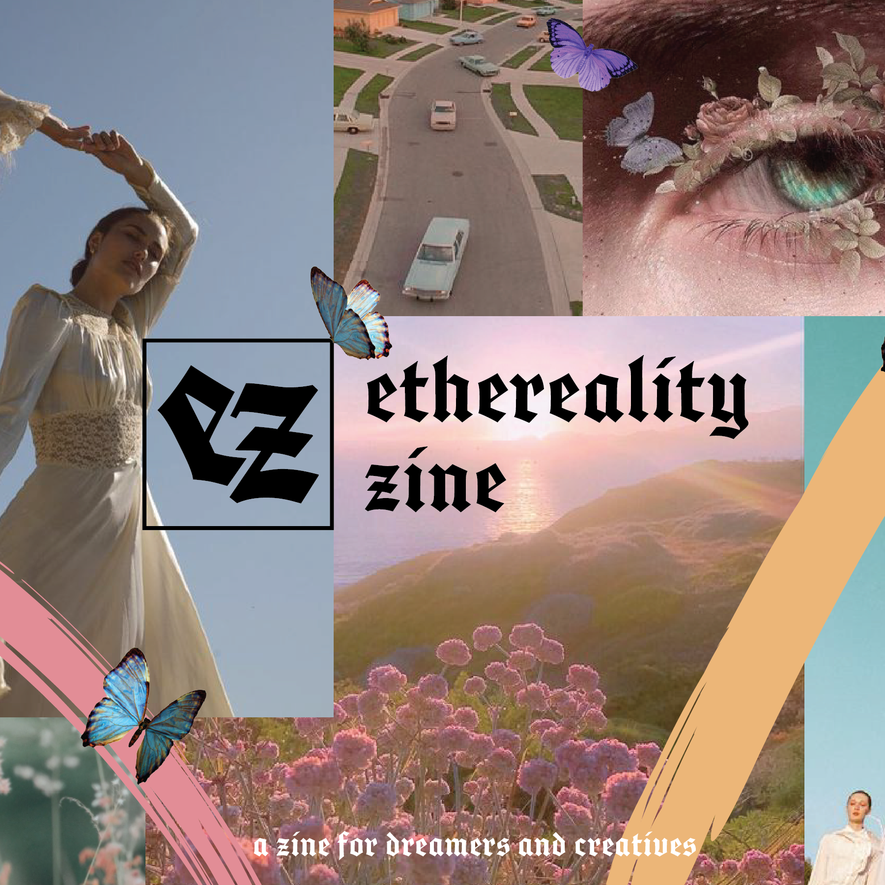
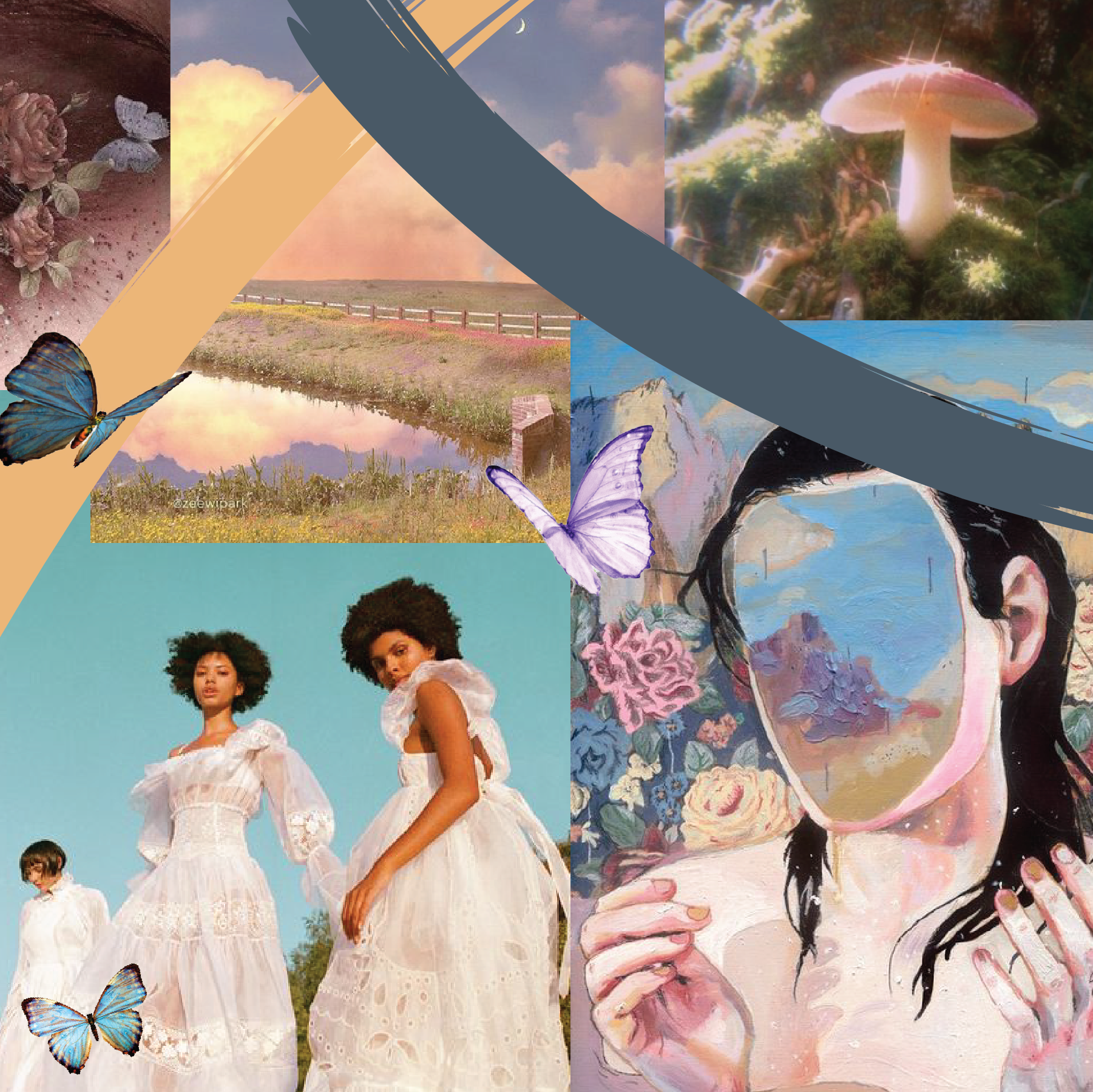
Ethereality's Branding: From the questionnaire, the founder of EZ and I concluded that they wanted Ethereality Zine to be "soft and dreamlike," "dark, sweet, muted," and give off the feeling that it was a zine for dreamers and creatives. The founder explained that the mood and imagery of the zine were intended to be "a blending of the ethereal and reality"—hence the name "Ethereality." For this version of the zine I created the branding as well as a five day logo reveal countdown and a "banner" for instagram—three squares that overlap in design to create a singular image when beside each other.


Kore Mag Branding: Before Ethereality Zine was fully created and the logo shared, the founder put the zine on hiatus due to personal reasons. Once they were ready to get back into the zine community, the founder decided to rebrand and take it in a different direction!
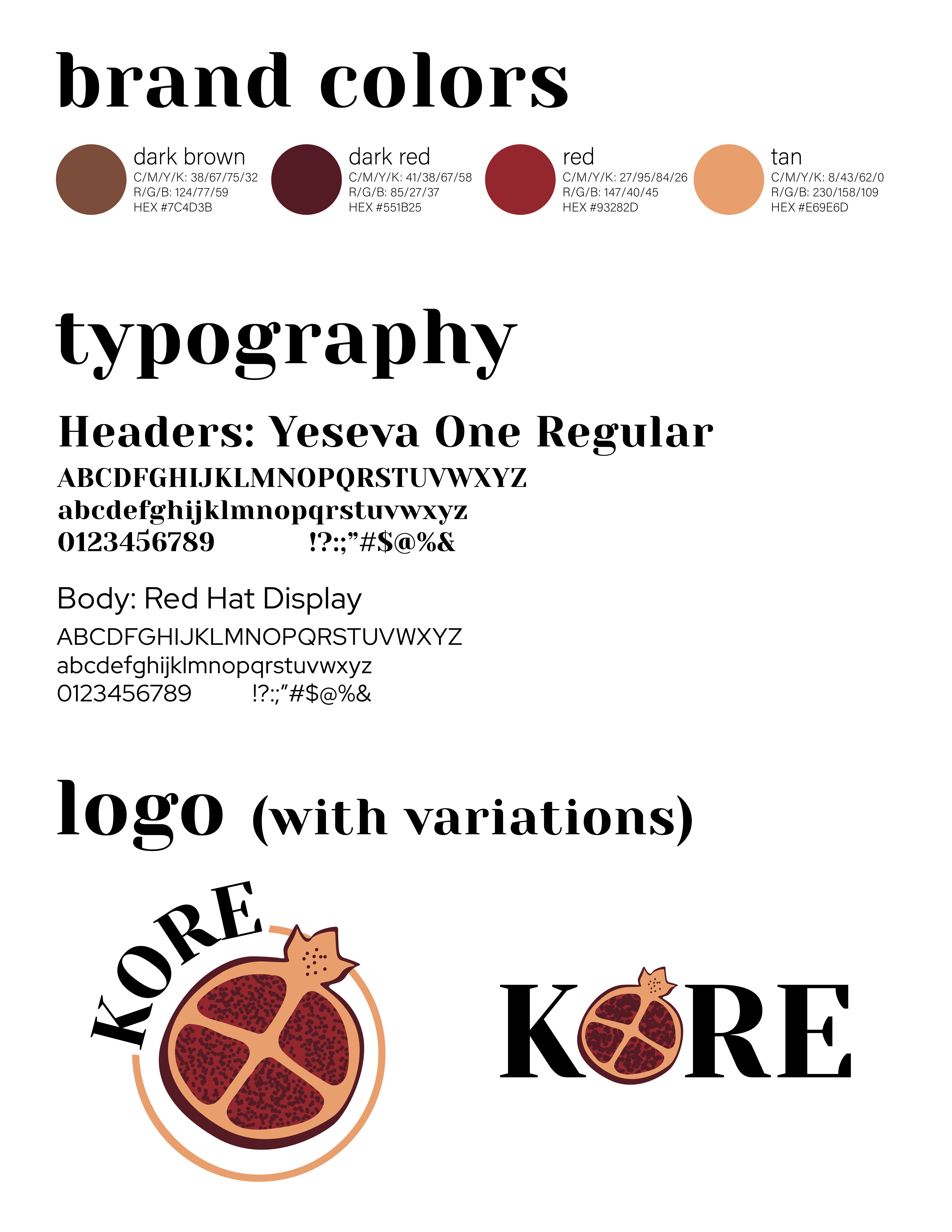
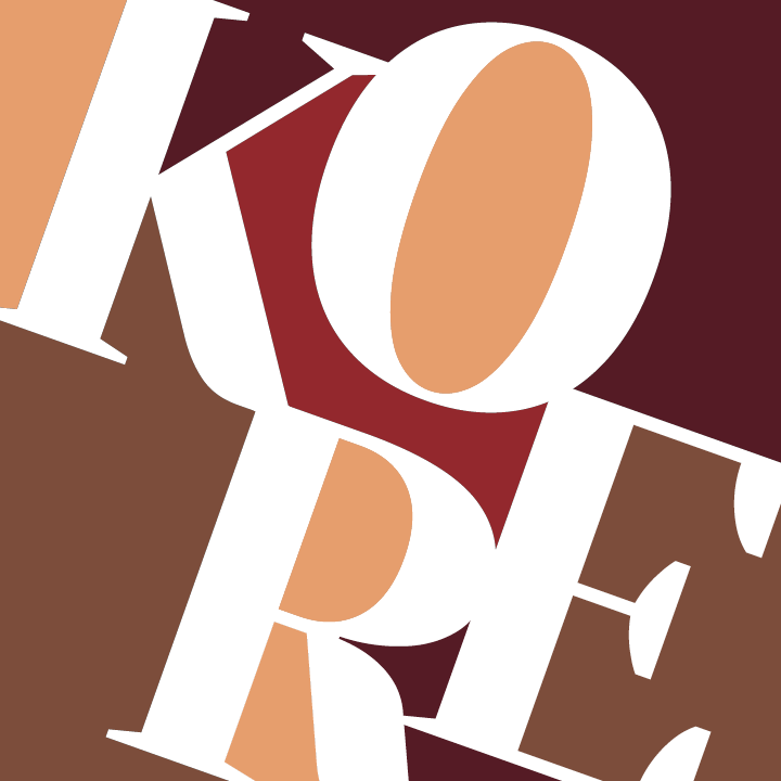
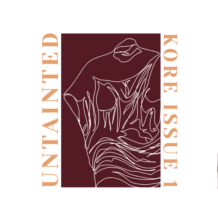
Seeing as I was a designer for the zine and had created the previous logo for them, the founder entrusted me with the re-design as well. Before giving them the questionnaire again, the founder, with other team members and myself, brainstormed a new zine name. Once we were decided, I provided them the questionnaire, and the founder decided the new zine should feel "young, vulnerable, and human." The mood and imagery of this version of the zine were intended to "focus on both the good and bad aspects often within the same subject." For this version of the zine, I created the branding as well as graphics explaining the rebrand and introducing the theme of the first issue.