My Role: Lead Designer
What I did: brand identity design
What I did: brand identity design
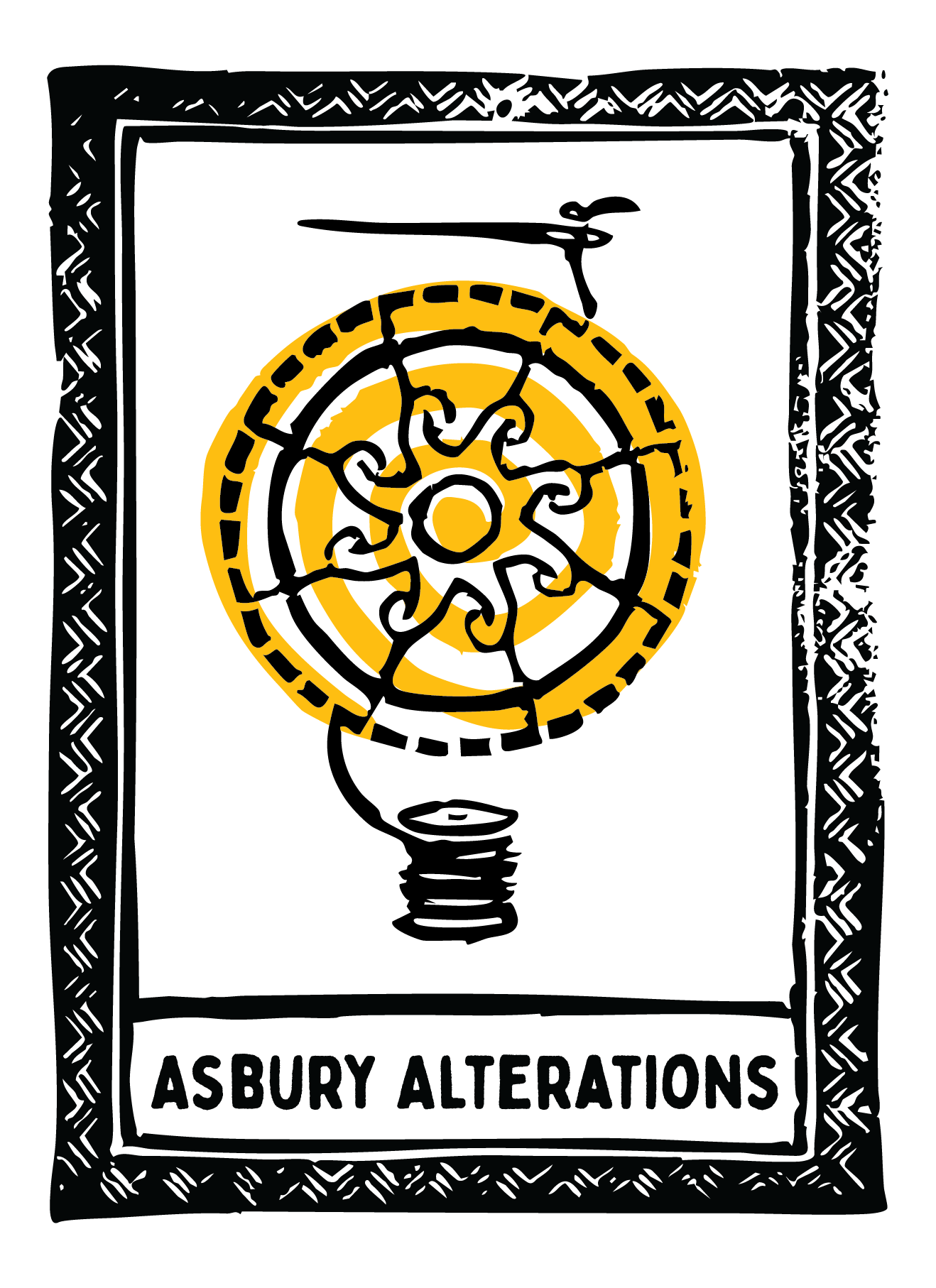
Lauren (she/they) of Asbury Alterations reached out for assistance rebranding her business. The goal was to incorporate the aesthetics of Asbury Park, NJ — bright colors, fun street art, welcoming and warm — and the visual design hierarchy of a tarot card. After a call to discuss elements to keep, cut and bring in, I developed moodboards to finalize a direction.
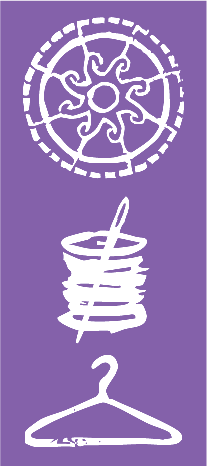
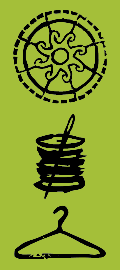
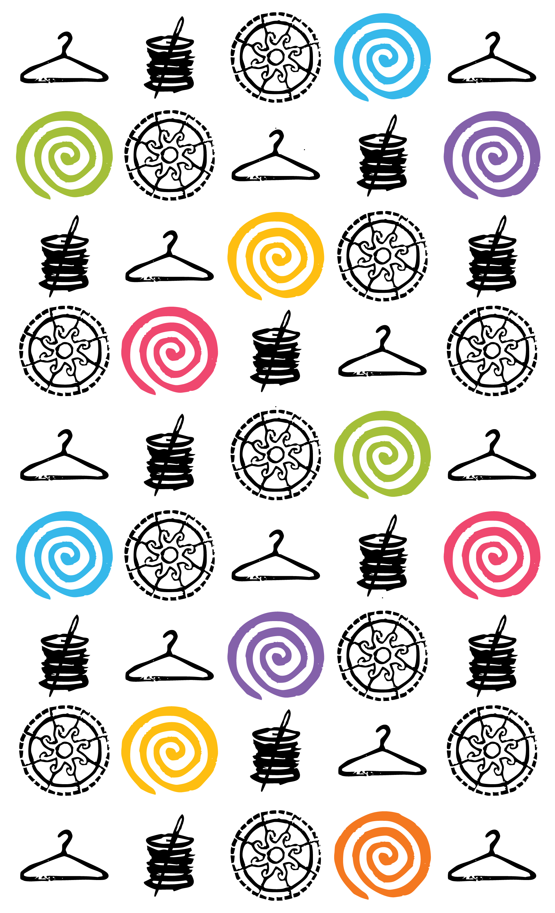
What we ended up with, is this: a linocut print of Asbury Alterations' tarot card — a combination of The Sun and the Wheel of Fortune. The sun in the imagery pays homage to Lauren's previous logo and is partly inspired by the ironwork detailing of the Asbury Park Carousel House.
The Sun card is often viewed as "the happiest card in the deck." It represents a time of clarity, optimism and personal growth and encourages the receiver to embrace themselves and the work they've done. The Wheel of Fortune card represents the turning of tides, the cyclical nature of time and sudden changes (for the better).
These two cards as inspiration for this design stand true to Lauren and Asbury Alterations mission of acceptance, empowerment and making clothes fit the changes that bodies naturally follow — as they say themself "We want to help empower you to present yourself the way you want to be seen in a way that works for you."